
Digitom
CLIENT
Digitom
YEAR
2026
SERVICES
Website Design, Development, Hosting & Support, Content
WEBSITE
https://digitom.tvWhen a corporate video production company comes to you with a website that looks fine at first glance, you are dealing with a specific type of digital problem – the first-glance fallacy.
On paper, the original website for award-winning video agency Digitom was acceptable. It was clean, dark, and filled with video thumbnails. But look closer, and the commercial infrastructure was entirely missing. The messaging was confusing, audience segmentation was absent, and there was no obvious conversion journey. It was a classic portfolio site that expected the user to do all the heavy lifting to figure out if Digitom was the right fit.
We redeveloped the platform from the ground up, turning a passive creative gallery into a highly structured conversion tool designed for busy UK marketing managers and corporate founders.
Here is exactly how we did it.
The diagnostic – Why looking good is a conversion trap
The original site suffered from a major flaw – it prioritised creative output over user intent.
When a marketing manager lands on a video agency website, they rarely look for general content. They are looking for a specific solution – a video to support an internal communications campaign, a recruitment drive, or a training programme.
Digitom had the track record to prove they could handle all three, but the original layout forced users to wade through mixed galleries to find relevant work. The messaging lacked punch, and the final call to action was a generic, friction-heavy form sitting next to an distracting map.
If your target audience has to search your site to understand what you actually do, they simply leave.
Discovery and wireframes – Defining the narrative before the visual design
The most critical part of this transformation happened before we wrote a single line of code or opened a design tool. We started with an intensive discovery and wireframe process. As so often is the case, this phase became a highly positive experience for the client, as it provided the structured space required to truly express what Digitom is all about.
Too often, agencies rush straight into the visual design phase, dazzling clients with polished mockups before solving the underlying structural issues.
We do things differently. By focusing entirely on structural wireframes first, we stripped away the distraction of imagery and video assets to focus purely on hierarchy, message clarity, and user flow.
During these sessions, the client was able to articulate the strategic weight behind their films. They don’t just shoot beautiful footage; they solve complex operational and corporate communications challenges. The wireframe process allowed us to map out exactly how a visitor moves from initial curiosity to deep trust, ensuring every content block served a specific commercial purpose. By the time we approved the wireframes, the client had absolute confidence that the blueprint of the site perfectly reflected their brand ethos.
The architecture shift – Creating service clarity and elevating insights
In the original build, the services were not described on dedicated pages at all. A visitor was simply expected to look at video thumbnails and infer the scope of Digitom’s capabilities. We completely erased this friction by building a dedicated service architecture.
We introduced an overview Services page that explicitly outlines what Digitom offers. From there, we developed individual, high-intent service pages structured around three core corporate challenges:
- Communications: Focused on reputation, trust, and public-facing campaigns.
- People and Culture: Focused on internal engagement, recruitment, and employer branding.
- Learning and Development: Built specifically to influence employee behaviour and demonstrate best practice.
Each of these individual service pages connects directly to relevant case studies and project work. A Head of People can now click through to a page written entirely in their language, seeing only recruitment and culture-led films. They don’t have to look past heavy plant machinery training videos to find the human stories they care about.
Furthermore, we noticed that valuable industry thought leadership and deep case studies were completely buried under a generic “News” heading on the original site. We completely eliminated the “News” section, elevating it to a prominent “Insights” tab in the top navigation. This section now elegantly houses both high-value industry perspectives and deep-dive case studies, making it simple for busy marketing directors to evaluate Digitom’s strategic expertise.
Visual design – Evolution over revolution
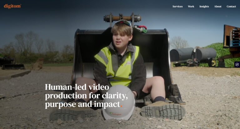
When we moved onto the visual design phase, our goal was not to strip away the established Digitom identity, but to elevate it. We opted for a cleaner, brighter presentation that retained their signature sophisticated aesthetic while dramatically improving readability and modern appeal.
Instead of over-dressing the interface with unnecessary visual noise, we relied on subtle, consistent details to establish an authoritative yet friendly tone. A key element of this is the implementation of a distinct orange dot immediately following the main titles and section headers. This tiny detail acts as a quiet, confident signature across the entire layout. It anchors the typography and injects personality without distracting from the core content or the high-quality video production assets themselves.
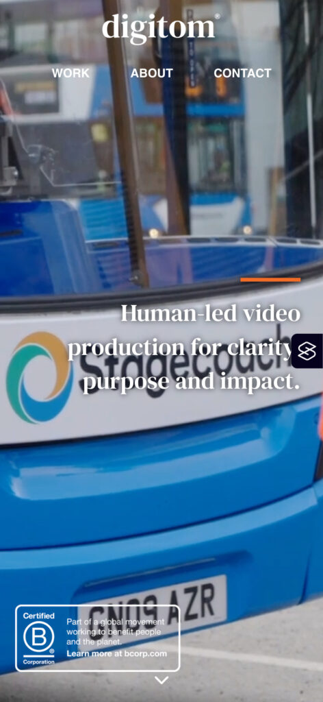
Original digitom.tv
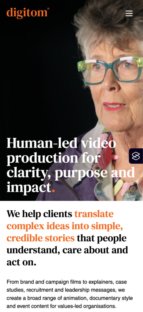
The new homepage
Engineering performance – Solving the video-heavy slowdown
The absolute biggest technical hurdle with an agency site like Digitom is speed. It is an industry wide problem – video production sites are notoriously bloated, slow, and frustrating to navigate because they are weighed down by heavy, auto-playing video assets and unoptimised media grids.
We refused to let performance suffer for aesthetics. Our engineering standards are built around a quality-first philosophy, which meant getting this site to fly despite being packed with video content.
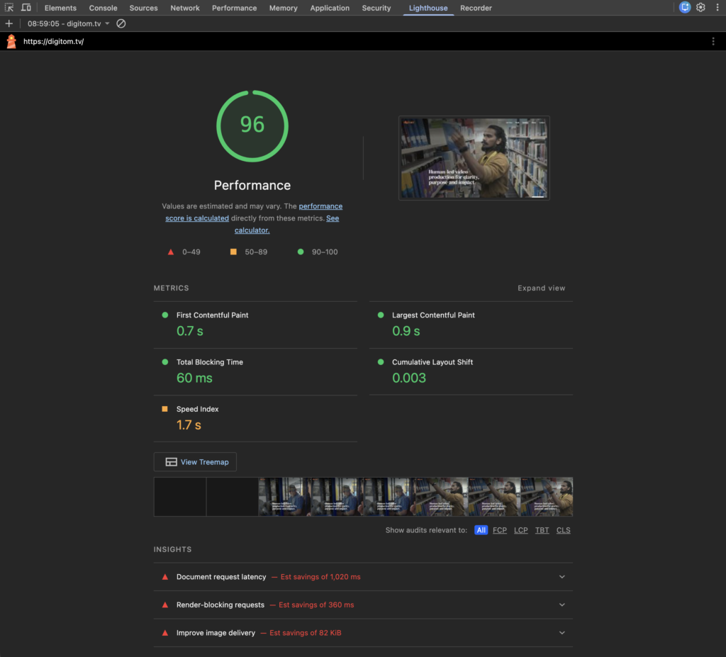
We achieved an incredible Lighthouse performance score of 96 by overhauling how the site handles assets. We implemented aggressive lazy-loading protocols, meaning videos and heavy graphics are only loaded the millisecond before they enter the user’s viewport.
We also utilised modern, next-generation video compression and delivery formats alongside custom-coded container wrappers. This stops the browser from stalling while waiting for media to render. By optimising the critical rendering path and eliminating render-blocking resources, we proved that you can have a visually stunning, video-rich website without forcing users to sit through loading spinners.
Inclusive design – Achieving WCAG 2.1 AA compliance
True quality means a site works flawlessly for everyone. Because Digitom partners with values-led sectors, local authorities, and major corporate bodies, accessibility was a non-negotiable metric for this build.
We engineered the site to meet strict WCAG 2.1 AA compliance standards. This involved auditing every single design element to ensure a fully inclusive user experience.
We ran deep contrast testing on our updated, brighter colour palette to make sure all typography is easily legible for visually impaired users. We built a robust keyboard navigation framework, allowing users who cannot use a mouse to tab seamlessly through the entire site, including dropdown menus and interactive case study grids.
Furthermore, every element was built using semantic HTML code structures to ensure screen readers can effortlessly interpret the content hierarchy. By embedding accessibility into the core codebase rather than treating it as an afterthought, we ensured Digitom’s message is universally reachable.
Eliminating friction from the conversion path
A beautiful website is commercially useless if your contact journey is a chore. The original site featured a lengthy message box and a cluttered layout that did nothing to guide the user to the next logical step.
We replaced this with a dedicated, high-intent contact architecture called Let’s talk. We broke the contact options down into three distinct user preferences:
- Book a call: For users who want an immediate, structured slot in the diary.
- Send a message: A clean, minimal three-field form that takes less than ten seconds to fill out.
- Pick up the phone: An explicit, bold phone number for prospects who want to talk through a brief immediately.
This same footer framework appears across every single page on the site, ensuring that the moment a prospect feels enough trust to take action, the mechanism to do so is less than a scroll away.
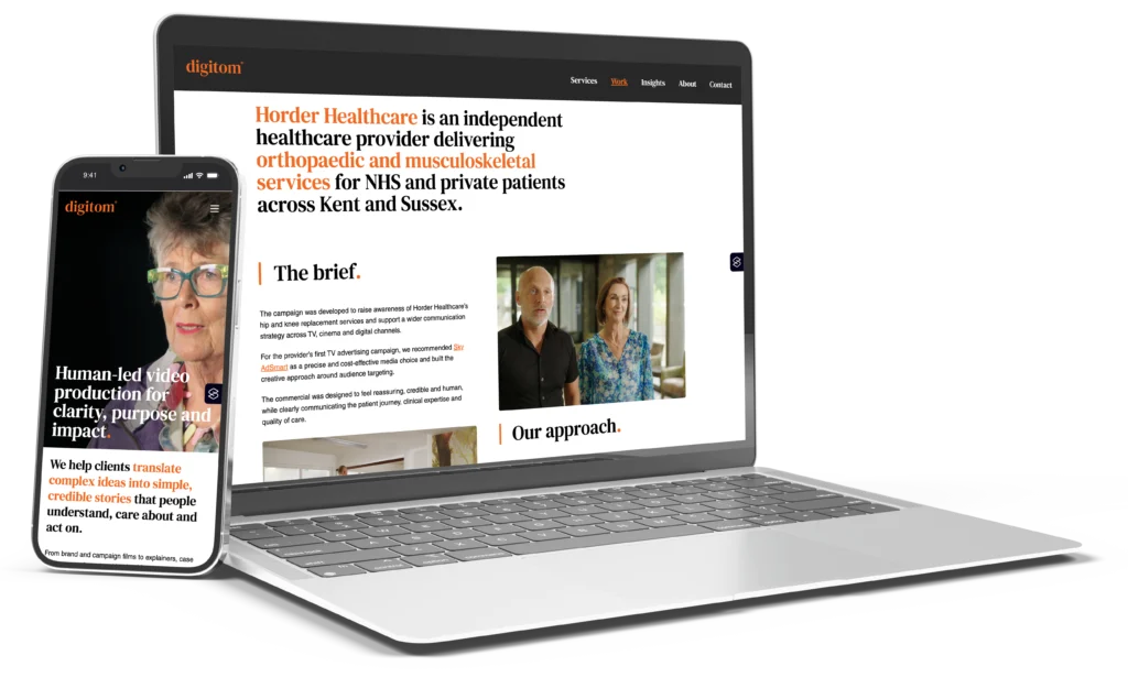
The transformation – From creative gallery to conversion engine
The new Digitom website is built for business outcomes. By balancing strong typography, deep structural code quality, and progressive layout design, we turned a confusing portfolio into a high-performing digital asset.
We didn’t just rebuild a website – we built a clear path for their clients to buy.